
Executive Summary
A well-built financial dashboard turns investor updates from a data dump into a strategic conversation. Investors want discernment more than data, and they look for proof that leadership knows which levers drive the business. The dashboard becomes the clearest expression of that understanding, or the clearest sign that it is missing.
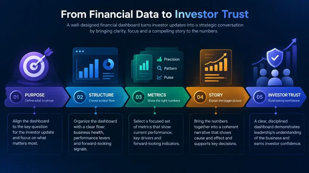
The sections ahead cover four layers of dashboard design: framing intention, structuring the layout, selecting the right metrics, and telling a coherent story. Together they show how a CFO can use one disciplined view of the business to earn lasting investor confidence.
Framing the Purpose of a Financial Dashboard
An unwritten contract governs every relationship between a CFO and investors. The terms ask finance to show what matters, surface it before anyone asks, and tell the truth without defensive dressing. A financial dashboard is where that contract becomes visible each quarter.
What Investors Want to See in Investor Updates
A dashboard packed with waterfall charts, blended run-rate tables, and segmented LTV curves can look impressive and still miss the point. Investors often respond to such displays with one simple request: show where the real tension lies. They want to see the three or four levers that make the engine turn and evidence that leadership can separate signal from noise.
Every redesign should start with one question: what is the company trying to prove right now? Operating leverage, product-market fit, and readiness for international expansion each call for a different visual language. A second question sharpens focus further, namely which three numbers the board should remember after the meeting.
Candor Builds More Credibility Than Polish
Clarity in a financial dashboard does not mean hiding weak spots. Showing a softening metric early, such as a cohort retention curve that flattens sooner than planned, signals that leadership is paying attention. Investors reward that candor, because it proves the team sees problems before outsiders point them out.
What stays off the dashboard matters as much as what appears on it. Many dashboards confuse density with sophistication, when real sophistication comes from economy. The strongest financial dashboard feels calm, showing the whole business in one view without looking like an exploded spreadsheet.
Structuring the Financial Dashboard Layout
Layout works like the blueprint of a house, where every wall and doorway reflects a decision. Items in the spotlight become headlines, items in the margins become subtext, and omitted items become assumptions. One useful starting exercise is to ask what the CFO would say first with only ninety seconds to explain the business.
A Three-Part Flow for Investor Updates
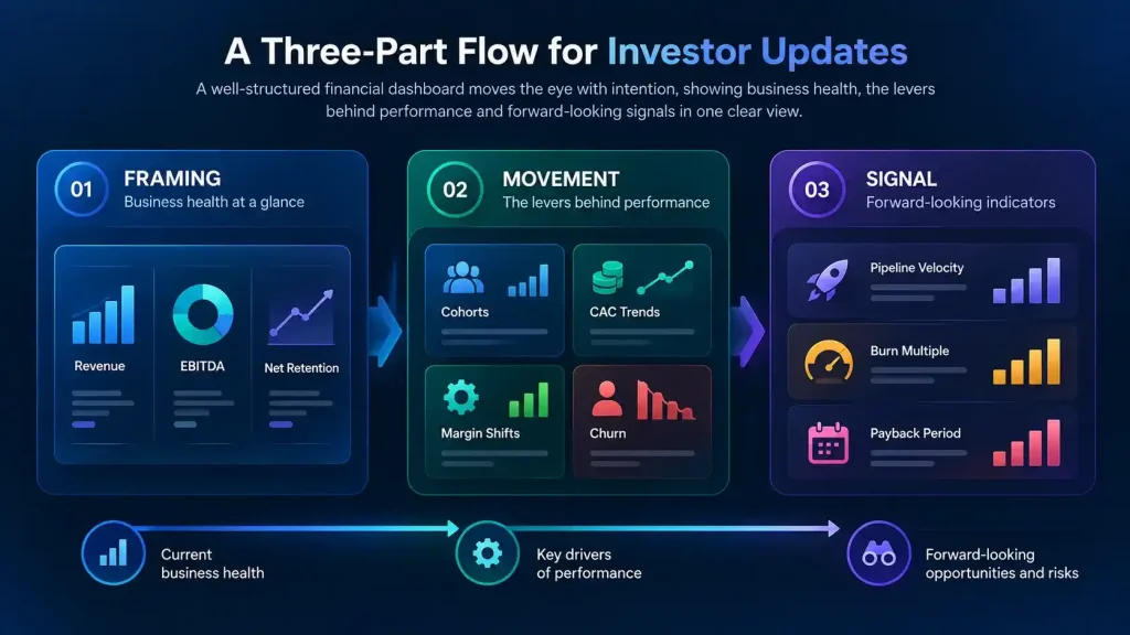
A strong financial dashboard moves the eye with intention instead of leaving readers to wander. A simple three-part flow keeps investor updates coherent:
- Framing: headline metrics such as revenue, EBITDA, and net retention that ground the reader
- Movement: the levers behind those outcomes, including cohorts, CAC trends, margin shifts, and churn
- Signal: forward-looking indicators such as pipeline velocity, burn multiple, and payback period
Placement on the page also creates meaning for the reader. Pairing a rise in marketing spend with sales-qualified leads and conversion rates answers the obvious question before anyone asks it. Juxtapositions like these act as silent arguments, letting investors hold cause and effect in the same frame.
Consistency, White Space, and Open Questions
Typography, color, and alignment set the tone as much as the numbers do. A consistent visual library, with the same scale for every retention curve, signals discipline before anyone speaks. A Euronext Paris-listed gaming company with subsidiaries across five countries shows the value of this consistency. Rolling out Oracle Financials and MicroStrategy firmwide created a single definition of revenue across every subsidiary, which gave every report a common language.
White space is a form of respect, not waste. Seven well-placed charts outperform 47 crowded ones in almost every board meeting. A closing section called “What We Are Watching” invites dialogue about metrics still in flux. That section turns the dashboard from a statement into a conversation.
Selecting the Right Metrics for Investor Updates
The hardest part of dashboard design is restraint, since every metric shown sends a signal. Metric selection is an act of editorial judgment, and it reveals the thesis leadership holds about its own business. A helpful test is to ask which metrics, if removed, would leave the team blind.
The Precision, Pattern, and Pulse Framework
| Category | Purpose | Example Metrics |
| Precision | Verifies current reality | Revenue, gross margin, EBITDA, cash on hand, working capital turns |
| Pattern | Reveals the inner logic of the business | Gross and net retention, CAC, LTV, payback period, contribution margin |
| Pulse | Signals what may be coming | NPS, product engagement, pipeline velocity, time to onboard |
Applying the Three Categories
Precision metrics are not optional, yet the choices around them still matter. Splitting revenue into new versus recurring, or billed versus collected, signals control over the numbers. Pattern metrics show whether the business compounds its advantages or runs in place. Weak retention therefore belongs in plain view instead of an appendix.
A marketplace SaaS platform raising a $20M Series B illustrates the weight of pattern metrics. Cohort analysis and unit economics models anchored investor diligence and withstood close scrutiny during the round. Consolidated reporting across US and Polish operations gave investors one coherent view of the business.
Pulse metrics are the hardest to choose well. If they are too soft, they sound like marketing; if they are too complex, they confuse the audience. The best ones correlate, even loosely, with future economic outcomes and hint at change with integrity.
Telling the Story Behind the Financial Dashboard
A dashboard in its highest form is a lens, not a mirror, since it focuses attention on what matters most. Investors remember decisions far longer than they remember deltas. The CFO uses the financial dashboard to tell the story of those decisions and the reasoning behind them.
Writing the Narrative Before Building the Slides
The story behind a financial dashboard begins with context, not revenue. Each quarter carries a central question, such as growth versus profitability or rising churn, and every chart should orbit that theme. Drafting a few paragraphs before building any slides helps reveal the heartbeat beneath the metrics. Charts then confirm, challenge, or explain that narrative arc.
A simple three-act arc keeps investor updates focused and memorable. It covers where the company stands, how it got there, and what it will do next. When investors can retell that arc in one sentence, the dashboard has done its job.
Building Blocks of a Trusted Investor Dashboard
| Intention | Structure | Metrics | Story |
| Know what the company must prove | Guide the eye from health to signal | Curate precision, pattern, and pulse | Explain decisions with calm confidence |
Tone and Trust in Judgment
The right tone is calm confidence, avoiding both celebratory excess and apologetic caution. A brief annotation that owns a difficult trade-off can turn a defensive moment into a strategic discussion. A venture-backed digital marketing company that raised $36.5M across three funding rounds shows why this matters. Its CAC, LTV, and contribution margin discipline supported growth from $9M to $180M, giving investors a consistent logic to follow round after round.
Over time, showing the decision process builds trust in judgment, not only in results. Investors begin to back leadership choices because they understand how the team thinks. That trust becomes the most durable currency a CFO can offer.
The Dashboard as an Artifact of Leadership
A financial dashboard reflects far more than the business; it reveals the leadership behind it. Built with intent, structured with care, filled with meaningful metrics, and narrated with clarity, it turns investor updates into genuine dialogue. No investor bets on a spreadsheet alone, and a well-crafted dashboard gives the team a clearer voice.
Three Key Takeaways
- Every financial dashboard should start with a clear purpose, built around what the company must prove and the few numbers investors should remember.
- Structure and metric selection work together to keep investor updates focused. A flow from health to movement to signal, paired with curated metrics, keeps attention on what matters.
- Storytelling turns data into trust, which means writing the narrative first, owning difficult trade-offs, and showing investors how leadership makes decisions.
Disclaimer: This article is intended for informational purposes only and does not constitute legal, tax, or accounting advice. You should consult your own tax advisor or counsel for advice tailored to your specific situation.
Hindol Datta is a four-time CFO and senior finance executive with over 25 years of leadership experience across cybersecurity, SaaS, gaming, logistics, digital marketing, medical devices, consumer products, and nonprofit organizations. He has led more than $120M in fundraising and over $150M in M&A transactions while building the financial and operational systems that let complex businesses scale with confidence. He is the author of seven books in the Systems CFO Series and holds active CPA, CMA, and CIA credentials.
AI-assisted insights, supplemented by 25 years of finance leadership experience.