
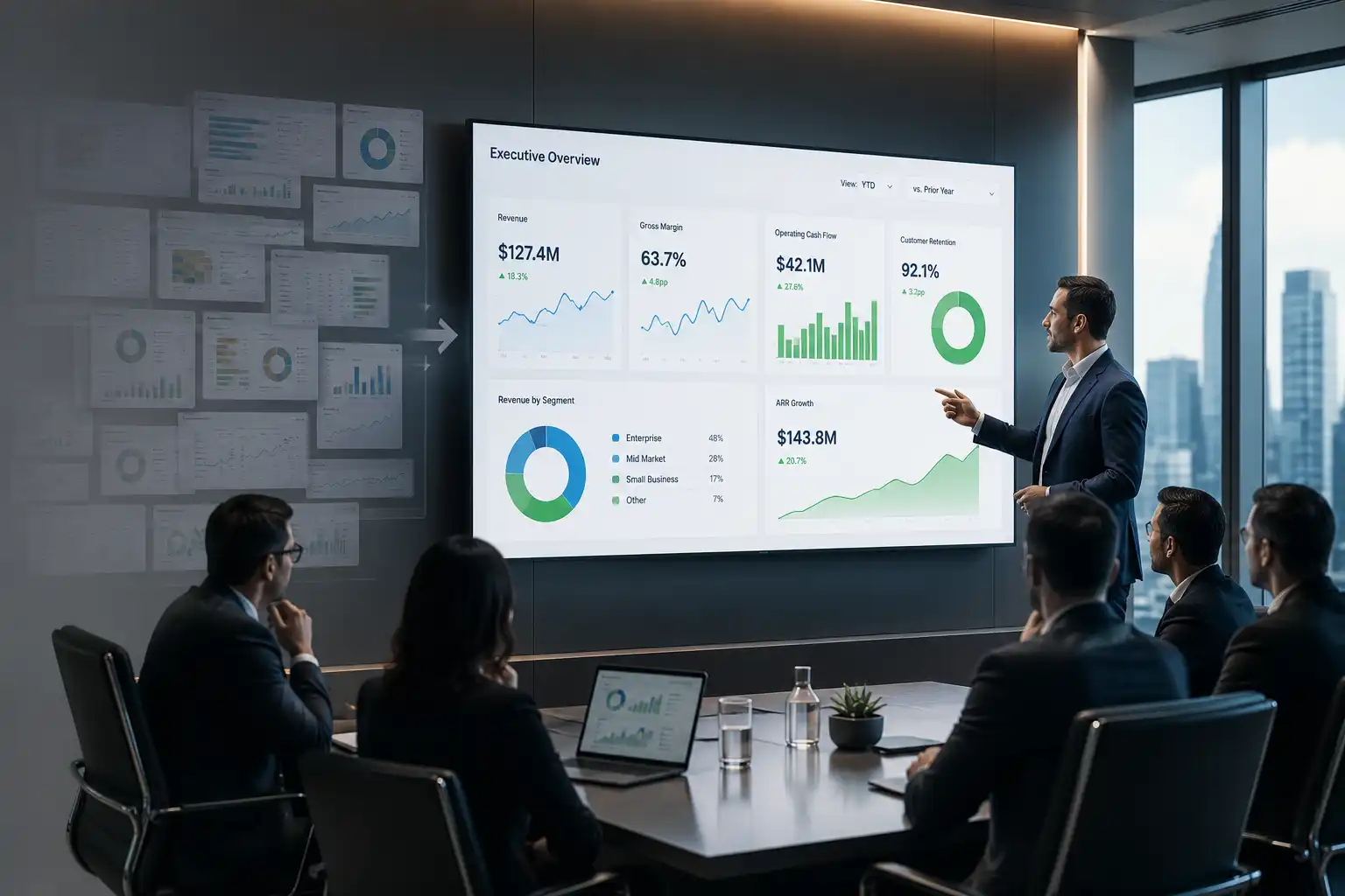
Executive Summary
Executives rarely suffer from a shortage of data. What they lack, more often than not, is signal. It’s the kind of clarity that changes what a leadership team decides to do next. I’ve spent more than 25 years leading finance across cybersecurity, SaaS, gaming, logistics, digital marketing, medical devices, and nonprofit organizations. In that time, dashboards have multiplied. Decision quality has stalled in place. That paradox sits at the center of these dashboard optimization best practices.
A dashboard earns its place at the table only when it changes a decision. Everything else is decoration dressed up as insight. What follows draws on finance transformations across very different industries. Examples include redesigning reporting architecture at a cybersecurity company and rebuilding board materials for a mission-driven institution. These experiences distill into a set of dashboard optimization best practices. Any finance leader can put them to work this quarter.
Why Dashboard Fatigue Signals a Need for Dashboard Optimization Best Practices
Most organizations don’t lack visibility. What they lack is a filter, a discipline for deciding what deserves a place in front of leadership and what doesn’t. Every function can now build a dashboard in an afternoon. The result is a proliferation of reporting that competes for the same scarce pool of executive attention. This isn’t fundamentally a technology problem, though it often gets treated as one. It’s a governance problem, and it belongs squarely with finance.
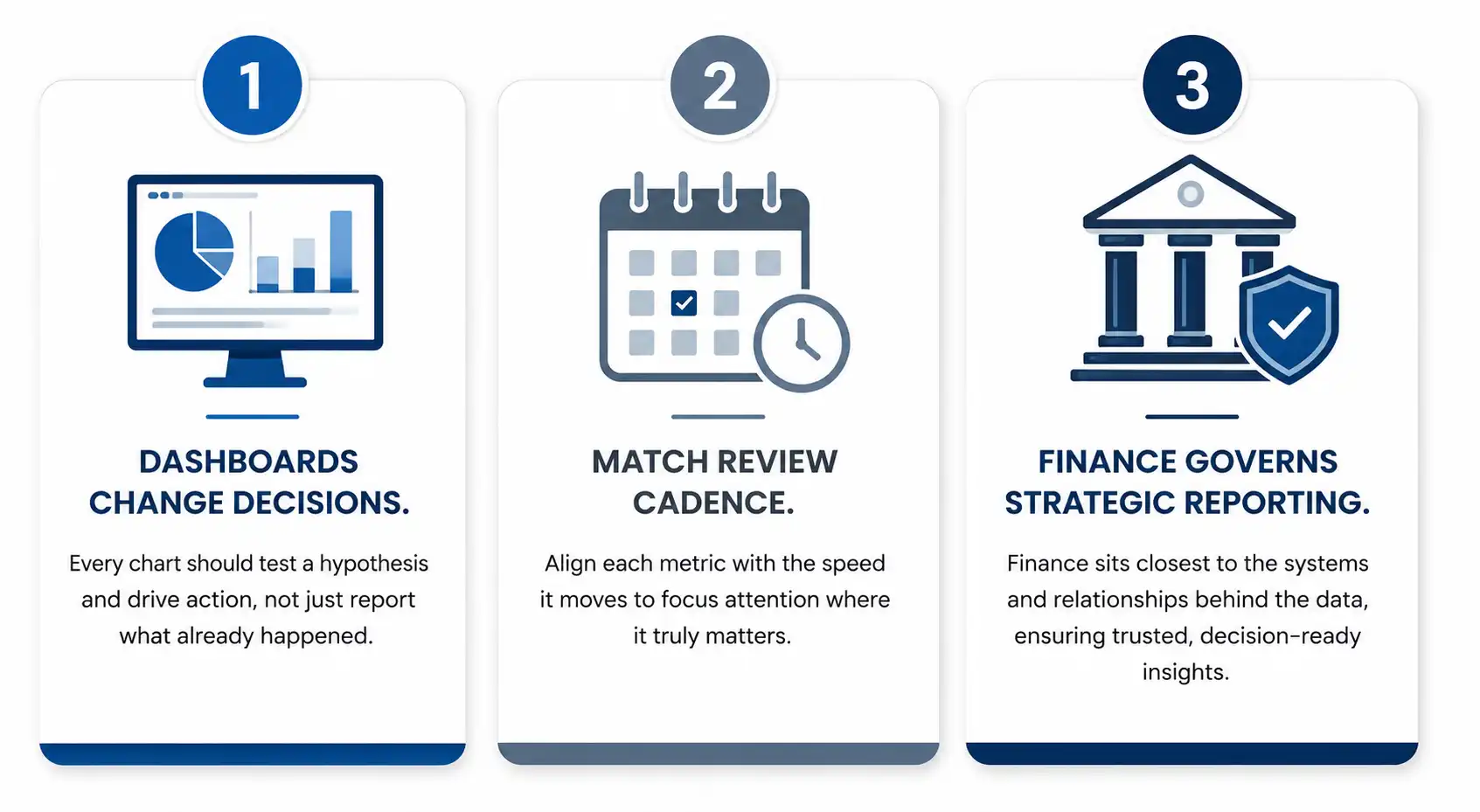
The CFO sits closest to the systems, the models, and the cross-functional relationships that generate this data in the first place. That proximity makes finance the natural steward of what gets built, what gets retired, and what gets trusted enough to guide a decision. Left unmanaged, dashboard sprawl quietly erodes decision quality even as reporting volume climbs. This is precisely why dashboard optimization best practices need to sit with finance, rather than with any single function chasing its own metrics.
This pattern repeats with consistency across sectors ranging from cybersecurity to gaming to nonprofit education. Leadership teams are rarely short on information, yet they remain uncertain about what to do next, because dashboards have become easier to build and harder to justify. The organizations that treat visualization as a discipline rather than a display are the ones that pull ahead of their peers.
When More Data Creates Less Clarity
A leadership team commissions a dashboard. It looks impressive, it gets reviewed once, perhaps twice, and then it quietly fades into the background of every subsequent meeting. Nobody deletes it, because deleting a dashboard can feel like admitting failure, so it lingers, adding to the noise that future decision makers must wade through before they reach anything useful.
While leading finance and analytics for a cybersecurity and identity access management company, the global finance architecture was redesigned across three countries, surfacing a hard lesson early: consolidation without curation simply produces a larger, more elegant pile of noise. Data reduces uncertainty only when it changes the next action a leader takes. When it does not, it adds friction to decisions that should already be clear, and dashboards, for all their color and detail, often answer questions nobody is actually asking while leaving the real strategic question untouched.
Building Dashboards Around Real Decisions: Core Dashboard Optimization Best Practices
Fixing this requires more than trimming a few charts here and there. It means rethinking the purpose of the dashboard from the ground up, starting with the question a dashboard is meant to answer rather than the data it happens to have on hand. A handful of practices tend to make the largest difference.
Design Around a Hypothesis, not a Summary
Every chart should test a specific question. For example: which customer cohorts show early signs of expansion readiness, rather than simply where those cohorts stand today. I used this hypothesis-driven approach while leading global finance for a $127M consumer products company. Its supply chain spanned ocean freight, trucking, last-mile delivery, and warehousing. The approach helped identify inefficiencies across the logistics network. It contributed to doubling inventory turns from 3x to 7x, releasing working capital that had been trapped in the system for years.
Pair Every Dashboard with a Short-Written Interpretation
A single sentence can turn a passive report into an active instrument of decision making. It states what the data suggests and what action should follow. That sentence, more than any chart beneath it, tends to be what a board member or executive actually remembers walking out of the room.
Match Cadence to Decision Rhythm
Sorting indicators into operational, tactical, and strategic tiers prevents the common trap of watching a slow-moving number so closely that its movement stops meaning anything at all. A metric checked daily should move daily; a metric that moves quarterly has no business anchoring a weekly review.
Score Every Metric on Signal Strength
Each visualization gets evaluated on its historical ability to correlate with a meaningful outcome, whether that outcome is renewal, margin improvement, or forecast accuracy. Metrics that fail to predict or guide a better decision get removed, not archived, not deprioritized, removed.
This governance approach often reveals something counterintuitive. The most polished dashboards are frequently the least useful strategically. The plainest ones, sometimes built from a single query, deliver the sharpest insight. One dashboard simply tracked the lag between proposal issuance and executive signature. It revealed that deal closure probability dropped sharply once that lag passed three weeks. That single insight reshaped an entire sales playbook, without a single animation involved.
From the Boardroom to the Front Line
This work is not only a finance function exercise. Its greatest value emerges when it synchronizes conversation across sales, product, customer success, and marketing, with finance acting as steward of context rather than gatekeeper of numbers.
Board meetings often open with a retrospective, reviewing revenue by line of business or expenses against budget. These reviews are useful, but they rarely surface the strategic debate the board actually needs to have. While leading fundraising efforts that included a $37M capital raise at a mission-driven education institution, board materials worked best when they replaced volume with leverage. Two dashboards built around genuine decision points outperform six pages of trend lines, because they point toward where attention, capital, and people should move next.
Every quarter, it’s worth asking which three to five non-obvious bets the organization is placing. It’s also worth asking which leading indicators will reveal whether they’re working. A related and often overlooked metric is decision velocity. This is the speed at which an organization moves from the first appearance of a signal to an actual decision. Tracking this reframes the entire purpose of a dashboard. It shifts the guiding question from what is informative to what actually helps the organization move.
Lessons From 25 Years Across Sectors
The same principles hold steady across markedly different industries, which is part of what confirms they are principles rather than tricks specific to one business model.
Scaling a venture-backed digital marketing organization from $9M to $180M in revenue over 24 months required dashboards that kept pace with rapid growth without collapsing under their own complexity. Overseeing more than $100M in gaming sector acquisitions demanded dashboards built for post-merger integration clarity rather than routine reporting. Reducing monthly burn from $800K to $200K at an early-stage digital marketing SaaS company depended on a small number of sharply focused indicators rather than an expansive reporting suite that nobody had time to read.
In every case, the organizations that treated dashboards as living tools, refactored and retired like code, made faster and more confident decisions than those that treated them as permanent fixtures bolted onto the wall.
Conclusion
Sharper dashboards come down to a single discipline: asking what a visualization enables someone to decide, and removing anything that fails that test. Across cybersecurity, logistics, digital marketing, gaming, and mission-driven institutions, the pattern holds constant. Elegant dashboards that answer no real question quietly become clutter, while modest ones tied to a genuine decision reshape strategy.
Finance leaders are well positioned to drive this shift. Finance sits closest to the systems, models, and cross-functional relationships that data touches every day. When a CFO treats dashboards as strategy infrastructure rather than decoration, guided by consistent dashboard optimization best practices, the organization begins asking better questions of its own data. That shift, more than any single tool or platform, is what allows a company to move with real clarity instead of merely the appearance of confidence. The work ahead isn’t to produce more visualizations. It’s to curate fewer, sharper ones that consistently earn their place at the table.
Disclaimer: This article is intended for informational purposes only and does not constitute legal, tax, or accounting advice. You should consult your own tax advisor or counsel for advice tailored to your specific situation.
Hindol Datta is a four-time CFO and senior finance executive with over 25 years of leadership experience across cybersecurity, SaaS, gaming, logistics, digital marketing, medical devices, consumer products, and nonprofit organizations. He has led more than $120M in fundraising and over $150M in M&A transactions while building the financial and operational systems that let complex businesses scale with confidence. He is the author of seven books in the Systems CFO Series and holds active CPA, CMA, and CIA credentials.
AI-assisted insights, supplemented by 25 years of finance leadership experience.