


Executive Summary
Most organizations, especially those in growth mode, operate under the comforting illusion that everyone is rowing in the same direction. Strategy is discussed, goals are cascaded, quarterly objectives are color-coded and reviewed. Yet beneath the surface, something drifts. Marketing chases leads. Sales chases logos. Product chases features. Finance chases burn. Each function, accountable and sincere, becomes a satellite orbiting its own metric of truth. The result is not chaos but dissonance. Teams work hard, even brilliantly, but the vectors do not converge. This misalignment is rarely malicious. It is the byproduct of tunnel vision, a kind of metric myopia where each department optimizes locally, unaware that the sum of those optimizations may subtract from the whole. Throughout my experience overseeing finance and strategy across organizations from BeyondID, where I designed enterprise KPI frameworks using MicroStrategy and Domo for tracking bookings, utilization, backlog, and annual recurring revenue, to managing global finance for a $120 million organization at Lifestyle Solutions, I have witnessed this pattern repeatedly. What I have learned is that no all-hands meeting or motivational memo can realign a company as effectively as a well-constructed financial dashboard. A true financial dashboard is not a scoreboard. It is a language, a lingua franca across functions that translates the abstract elegance of strategy into visible, relatable, shareable signals.
The Illusion of Alignment
I have seen this pattern in the early turbulence of Series A startups and in the layered complexity of public companies. The conditions differ. The symptoms rhyme. Each function operates with excellence within its domain, yet the organization as a whole struggles to achieve the exponential progress that integrated effort should produce.
The mistake most companies make is believing that more data equals more alignment. They produce dashboards that resemble cockpit control panels, dense, intricate, and indecipherable to anyone but the finance team. These dashboards are accurate. But they do not align. They alienate.
The Dashboard as Common Language
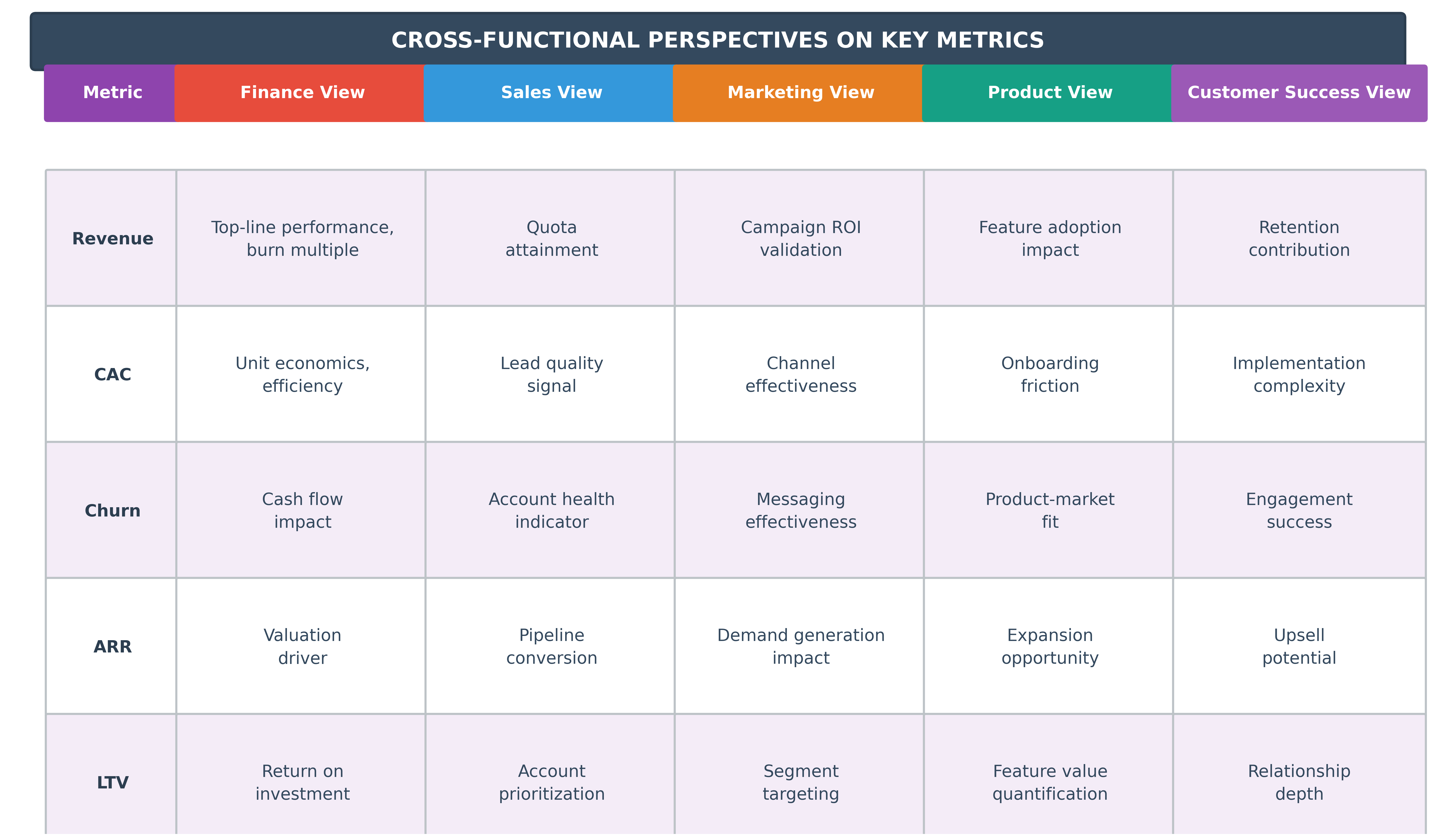
The goal is not to show everything. The goal is to show what matters, and more importantly, to show it in a way that lets each function see themselves in context. A revenue target, on its own, is a number. But show that number as a composition of lead velocity, win rates, average deal size, and churn, and suddenly marketing sees its hand in revenue. Product sees the impact of features on expansion. Customer success sees their role in retention. What was once the CFO’s chart becomes the company’s chart.
This is alignment not as edict but as epiphany.
How Metrics Create Cross-Functional Visibility:
Designing Dashboards for Alignment
In constructing dashboards over the years, I have developed an almost painterly respect for their design. Not aesthetic design, though clarity matters, but narrative design. What story does this dashboard tell? What questions does it answer? What questions does it provoke?
Each metric is a brushstroke. Too many, and the picture becomes muddled. Too few, and it lacks dimension. The art lies in curation. But beyond metrics, the true power lies in relationships, how one metric relates to another.
Key principles for dashboard design:
- Show context, not just numbers: A spike in CAC is less alarming if paired with a corresponding increase in LTV
- Surface causality: A dip in revenue may be strategic if it accompanies a conscious churn of low-value customers
- Enable self-service insight: Each function should be able to see their contribution without requiring finance interpretation
- Build narrative connections: Link leading indicators to lagging outcomes so teams understand how their actions compound over time
I remember a dashboard we built at a late-stage fintech company, one that mapped NPS data from support tickets to product release cadence, then overlaid churn risk by customer segment. Suddenly, teams that rarely spoke were seeing their actions on the same canvas. Support could see how their response times fed directly into retention. Product saw how bugs they triaged weeks ago still echoed in sentiment. Revenue leaders understood which clients were most fragile.
We did not need more meetings. We needed that dashboard.
The Discipline of Integrity
There is a myth in modern business that data tells the truth. It does not. Data is obedient. It reflects what it is fed and what is asked of it. It does not protest, correct, or interpret. It conforms. When executives point proudly to a dashboard, the real question is not how clean the data looks. The question is: how clean is the culture that produced it?
A dashboard is a mirror, but it does not clean the face. It only reflects what is already there.
Cultural prerequisites for clean dashboards:
- Psychological safety: People report what is real, not what is rewarded
- Accountability without blame: Teams can acknowledge misses without fear of consequence
- Transparency as default: Hiding inconvenient truths is culturally unacceptable
- Curiosity over judgment: Anomalies trigger investigation, not punishment
- Cross-functional trust: Departments share sensitive data without territorial behavior
Throughout my tenure at organizations including Singularity University, where we secured $40 million in Series B funding, I learned that the soul behind the numbers matters more than the precision of the calculation. Culture is the soil in which metrics grow. Integrity is the sunlight.
At the heart of a clean dashboard is not data integrity. It is human integrity. It is the sales manager who logs a deal loss accurately, even though it means missing quota. It is the product leader who delays a metric update because the release introduced a bug. It is the CFO who chooses to display a lagging margin metric, knowing it will raise eyebrows, but also knowing that this moment is precisely when transparency matters most.
The Transformation of Truth
I remember a company I supported during its growth from Series B to D. The first dashboards we rolled out showed wild volatility in churn, cost of customer acquisition, and engineering throughput. My initial instinct was to triage the anomalies, to fix the dashboard. But slowly, we realized that the dashboard was not broken. It was honest. It was reflecting exactly what was happening. Churn was volatile because onboarding was inconsistent. CAC was unstable because targeting was imprecise. Engineering velocity was jagged because requirements changed too frequently.
The dashboard was not messy. The business was. And once we saw that, we could begin.
That shift, from seeing data as a flaw to seeing it as a friend, is one of the deepest cultural inflection points a company can experience. And it only happens when integrity is not a word on a wall but a daily decision.
Orchestrating Shared Understanding
There is a moment, often subtle, when a company begins to drift, not because its numbers are wrong but because its people read those numbers differently. The data is the same for everyone. What changes is the interpretation. And in that space, between the chart and its meaning, between the metric and the meeting, lies either clarity or confusion, cohesion or chaos.
A revenue dip can mean a seasonality effect to one executive, a market signal to another, and an operational failure to a third. A 4.3 percent drop in net retention may trigger calm adjustments in one function and quiet panic in another. The numbers do not lie, but they do not explain themselves either. They are fragments of a mosaic. Meaning must be assembled.
The Three Disciplines of Dashboard Alignment
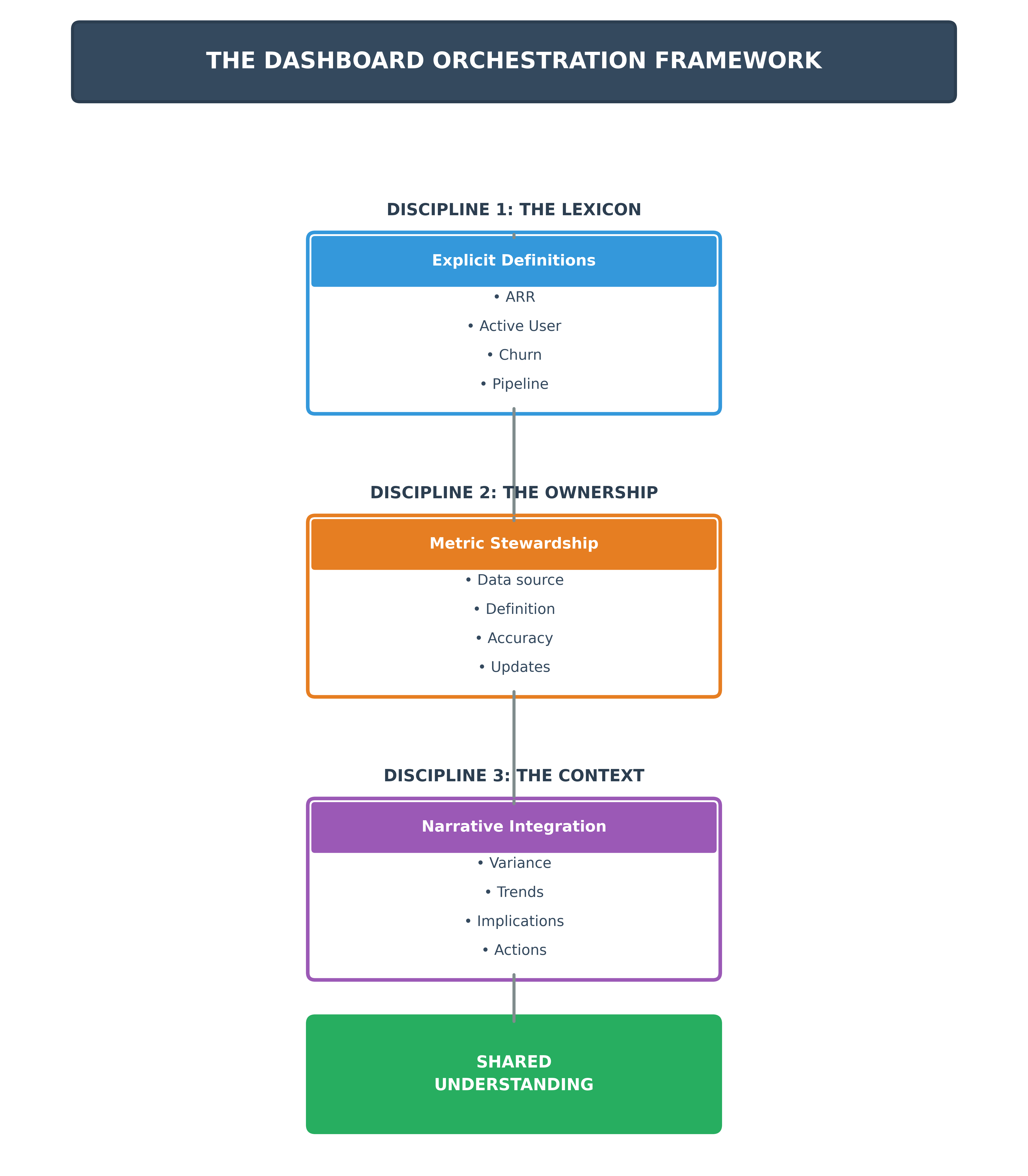
Orchestrating alignment is not a one-time act. It is a discipline. It requires attention, repetition, and a deep respect for semantics. I have learned to approach it in three distinct movements:
First, the Lexicon: Every dashboard should come with a dictionary. Not buried in the appendix. Not locked in the data team’s documentation. It should live where the data lives, next to every metric, inside every report. ARR should be defined. Is it gross or net? Does it include expansion? How is churn handled? Active user should be defined. Is it daily, weekly, or rolling thirty-day?
This lexicon must not be assumed. It must be explicit. Words, in business, are like currencies. Their value depends on shared belief. Without it, interpretation fragments.
Second, the Ownership: Metrics without owners are orphans. For each KPI, someone must be accountable, not just for hitting the target but for maintaining the integrity of the definition, the freshness of the data, the accuracy of its source. That owner is not always finance. It might be RevOps, Product Analytics, or HR. What matters is clarity.
This ownership prevents what I call metric erosion, the slow, subtle decay that happens when no one watches the boundary lines, and suddenly a 92 percent metric becomes a 78 percent metric simply because the numerator changed, or the time window shifted, or someone updated a SQL query on a Thursday night.
Third, the Context: No dashboard lives in a vacuum. Metrics must be framed in narrative. Variance must be explained. Trends must be interpreted. Without context, even accurate numbers mislead. A 10 percent drop in revenue could signal seasonality, churn, or a strategic pivot. The metric alone cannot tell you which. The context can.
This is why the most effective dashboards are not static reports but living documents. They are updated not just technically but communicatively. They are presented, not just emailed. They invite dialogue.
The CFO as Interpreter and Conductor
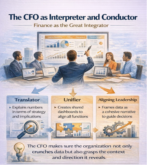
In companies where understanding is shared, someone is almost always playing the role of translator. Often, this role falls to the CFO. More than any other executive, the CFO sits at the intersection of all functions. Finance sees what others do not: how marketing’s spend profile affects margin, how product delays affect revenue recognition, how go-to-market acceleration affects cash runway.
But the CFO’s job is not just to know. It is to align. To make the numbers legible not just in their literal sense but in their implications. It means asking in the executive meeting, not just what happened but what are we taking away from this. It means translating a dip in CAC not merely as a win but as a hypothesis about customer fit. It means framing every metric as a signal in a broader narrative and ensuring that the story we are telling ourselves is coherent.
This is interpretive leadership. And it is the difference between an organization that reacts and one that understands.
Throughout my experience at organizations including Atari SA and Cryptic Studios, where I oversaw over $150 million in M&A transactions and post-merger integrations, I learned that the most effective leaders use story not to embellish but to anchor. They explain a variance with data but also with context, chronology, and causality. They describe not just what happened but why it matters. And they do it in a way that others can absorb.
From Reporting to Resonance
I remember working with a company where every functional head presented their own version of the truth at weekly staff meetings. Sales had a slide. Marketing had a dashboard. Product had a sprint board. Finance had a spreadsheet. Each function was brilliant. Each spoke a slightly different language. It was like listening to a symphony where everyone was playing their solo beautifully but without regard for the whole.
We decided to rebuild our dashboard, not as a report but as a single, cross-functional narrative. Each metric was debated. Definitions were forged in long, sometimes painful meetings. Ownership was assigned. Color codes were standardized. And then we did the most important thing: we told the story together.
At each meeting, I would walk the exec team through the same narrative. Here is where we are. Here is what the dashboard is telling us. Here is what has changed. Here is what it means. It was not flashy. But it was trusted. And over time, that trust became contagious. Teams began using the same language. Disagreements became more productive. Time once spent arguing over definitions was now spent making decisions.
The dashboard became a shared mirror. And in that mirror, the company began to move in concert.
The Discipline of Updating and Evolution
A dashboard, like a mirror, must be kept clean. Outdated dashboards are dangerous. They lull with the illusion of relevance. In some companies, I have seen dashboards celebrated when launched, then neglected like old furniture. Alignment erodes not from a lack of data but from a surplus of stale signals.
Part of the CFO’s role is to steward these mirrors. To ensure that what the organization sees is not a retrospective trophy case but a living artifact of current truth. That requires rigor: automated data flows, clear metric ownership, monthly validation. But it also requires adaptability.
As strategy evolves, so must the dashboard. The courage to retire a beloved metric, or introduce a controversial one, is the courage to lead with integrity.
My professional certifications as a CPA, CMA, CIA, CPIM, and PMP, along with academic credentials including an MS and MBA, provided technical foundations. But the real education came from building finance organizations, redesigning value-chain processes, and translating complex operating models into board-level insights across wildly different industries. These experiences taught me that dashboards are not just tools. They are artifacts of leadership philosophy.
Conclusion
A dashboard cannot build culture, but it can reflect it. And if wielded wisely, it can shape it. The organizations that thrive are not those with the most data but those that build a common language around it, a language that can hold nuance, that invites collaboration, that says we may not always be right, but at least we will be wrong together and wiser for it. Because in the end, data does not drive decisions. Understanding does. And understanding, like all precious things, is built deliberately, generously, and with others. To the CFOs and CEOs and operators reading this: your dashboard is your score. But your organization is your orchestra. Conduct it with care, with clarity, with patience, and above all with reverence for the fact that no number means anything until everyone agrees on what it means. When meaning is shared, action is swift. And when action is swift, execution becomes art. A true financial dashboard is not merely a reporting tool. It is a mirror that, when constructed with care, allows the organization to see itself not in fragments but whole. And in that wholeness lies the foundation for alignment, for trust, for the kind of coordinated movement that transforms good companies into great ones.
Disclaimer: This blog is intended for informational purposes only and does not constitute legal, tax, or accounting advice. You should consult your own tax advisor or counsel for advice tailored to your specific situation.
Hindol Datta is a seasoned finance executive with over 25 years of leadership experience across SaaS, cybersecurity, logistics, and digital marketing industries. He has served as CFO and VP of Finance in both public and private companies, leading $120M+ in fundraising and $150M+ in M&A transactions while driving predictive analytics and ERP transformations. Known for blending strategic foresight with operational discipline, he builds high-performing global finance organizations that enable scalable growth and data-driven decision-making.
AI-assisted insights, supplemented by 25 years of finance leadership experience.